Creative Product Packaging
Although sometimes packaging can be a bit of a gimmick, it's nice to see packaging used creatively, either as a marketing tool or to differ at POS. Here are some creative pack I liked from Demilked's 21 Creative Product Packaging post.

 Blush matches: Matches with a striking strip right on the panty. It just feels great to “light your fire”. (Advertising Agency: BBDO Berlin)
 Ford Ranger Extreme matches: New Ranger Extreme with extendable cargo bed. (Advertising Agency: JWT, Kuala Lumpur, Malaysia)


Kleenex: A professional designer appreciates something that is attractive, surprising, new, simple and devoid of useless information. The Kleenex “slice of summer” boast all of this at once. This packaging shows great maturity, because the consumer is not bombarded with information that he neither really needs nor wants. (Designer: Hiroko Sanders)

 Honey packaging for Klein Constantia Farm: The small white box resembles a bee have box with embossed ridges to denote planks of wood & nails. The famous Klein Constantia crest is gold foiled on the front of the box below the diecut slit that has one bee on its way into the box inviting you to open the packaging. The box opens to reveal a, bee covered, honey comb pattern as well as small diecut bees packaged inside each box. (Designer: Terence Kitching at At Pace design and Communication)
 Butter! Better!: “Whenever we eat bread, at the picnic, in the cafe or airplane, we usually use disposable butter. I replaced its ordinary container lid with a wooden, knife shaped one. This way butter can be easily and quickly spread. Butter! has 4 flavors which allow the user to make a choice, just as he would chose his favorite ice-cream. This container is not only easy and fast to use but also it makes daily routine of spreading butter more fun and exciting.” (Designer: Yeongkeun)

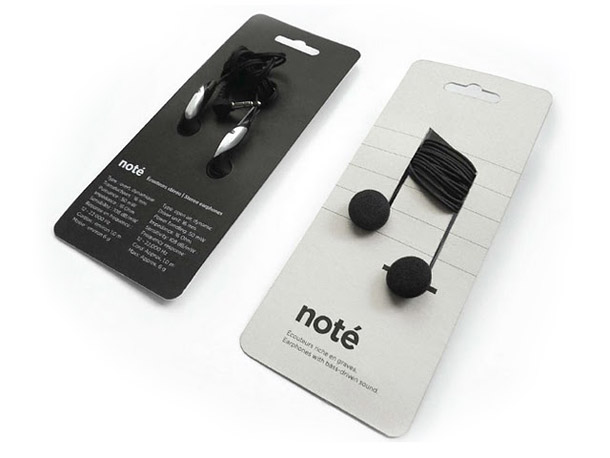
 Note: Choosing plastic wrap for non-perishable is often a choice that is unjustifiable for the real needs of the product. To address this problem, Corinne Pant looked at the real needs of electronic parts packaging. In a poetic and very functional gesture, it shows us once again that “less is more”. (Designer: Corinne Pant)

NYC Spaghetti: “I created this spaghetti packaging for a university project last year. The brief was to package one of 5 difficult items i.e. eggs, a rose, custard powder, spaghetti or marbles. I chose spaghetti.” (Designer: Alex Creamer)
 Japanese cookie: Clever Japanese cookie packaging. (link)


Kleenex: A professional designer appreciates something that is attractive, surprising, new, simple and devoid of useless information. The Kleenex “slice of summer” boast all of this at once. This packaging shows great maturity, because the consumer is not bombarded with information that he neither really needs nor wants. (Designer: Hiroko Sanders)


NYC Spaghetti: “I created this spaghetti packaging for a university project last year. The brief was to package one of 5 difficult items i.e. eggs, a rose, custard powder, spaghetti or marbles. I chose spaghetti.” (Designer: Alex Creamer)


Comments
Click our website